Shortly after the I uploaded the epub file in my previous blog post, I received the following email from Apple:
Dear [hidden by AZ – this is a client],
Your book, vendor ID: [hidden by AZ], could not be delivered. The following images are larger than two million pixels and must be resized:
Full ePub:
cover.jpeg
To calculate the image pixels, multiply the image height by its width. For more information on image specifications, see the FAQ module on iTunes Connect.
Once you have corrected the issue, you can resubmit your book.
Regards,
The iBookstore team
The screen resolution of the Retina display on the new iPad (aka iPad 3) is 1536 x 2048, or a total of 3,145,728 pixels, which is indeed a hell of a lot larger than two million. I thought I’d be clever and upload a cover that was precisely this size. Not allowed…or so I thought.
I halved the image to the resolution of the old iPad(s), 768 x 1024, for a more reasonable pixel count of 786432. Now, I could have calculated how big the file should actually be to get it just under two million pixels – which is approximately 79% of the max iPad image size, producing a file that is 1213 x 1618 and a total of 1962634 pixels – but I did it the easy way and re-uploaded the file, which earned me another minor scolding from iTunes Producer:
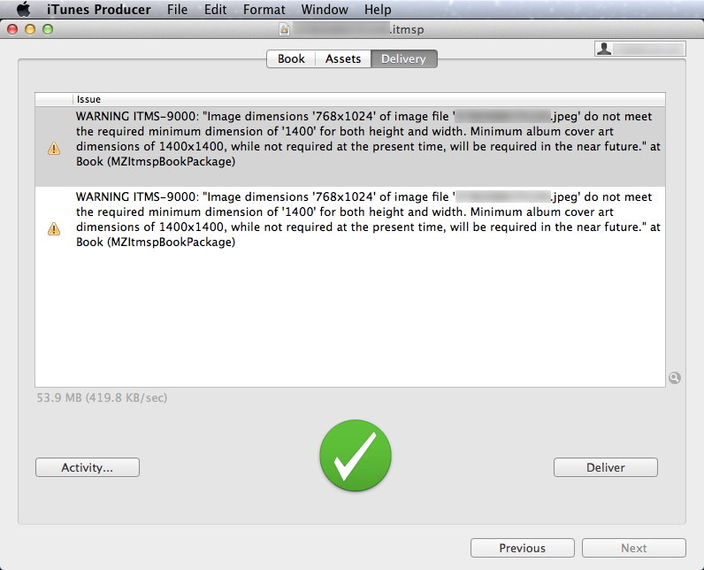
Now, you’ll probably recognize the fact that the largest possible cover I can create with those proportions of the iPad indicated above would be far larger than 2 million pixels: 1400 x 1867 for a grand total of 2,613,800 pixels. The very astute reader will also notice that I misunderstood the original email error, which referred not to the marketing image, but the cover embedded in my EPUB file. It took me a while to realize this. I blame sleep deprivation.
The other thing that occurred to me was that in the near future, cover designers will probably have to create square covers for books in addition to rectangular ones.
This is iTunes after all, which was originally designed for music, and there is really no need for covers to actually be rectangular anymore, as they will usually be displayed as icons anyway for interface purposes. I have no problem with that. And I don’t think Apple will be forcing publishers to create square covers in any direct way. But book buyers do expect book covers to be taller than they are wide simply because this is the most comfortable proportion for reading on a page.
The ideal line length for text layout is based on the physiology of the human eye. The area of the retina used for tasks requiring high visual acuity is called the macula. The macula is small, typically less than 15 percent of the area of the retina. At normal reading distances the arc of the visual field covered by the macula is only a few inches wide—about the width of a well-designed column of text, or about twelve words per line. Research shows that reading slows as line lengths begin to exceed the ideal width, because the reader then needs to use the muscles of the eye or neck to track from the end of one line to the beginning of the next line. If the eye must traverse great distances on a page, the reader must hunt for the beginning of the next line (fig. 7.18).
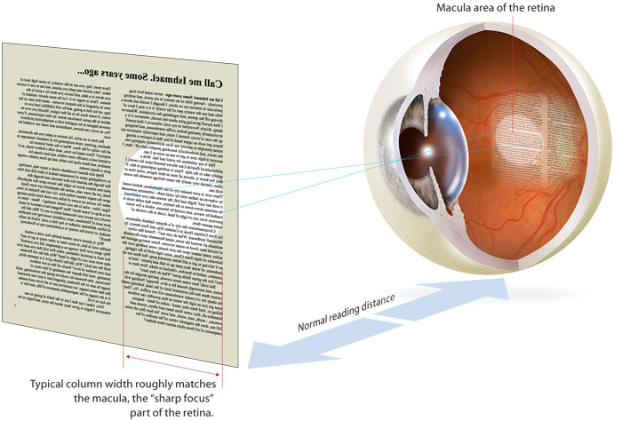
From Lynch, Patrick J. and Horton, Sarah 2008. Web Style Guide, 3rd Edition [Online]. Available at: http://webstyleguide.com/wsg3/7-page-design/6-page-width-line-length.html [Accessed: 10 September 2012].
With these constraints, a taller page makes sense because this allows for more text to fit on each page. So most people currently think of book content, print or digital, as a rectangular “object” that is taller than it is wide, and probably will for a long time – until we can “read” a single continuous line of text floating in space a few centimetres in front of our faces through our Google Glasses (or our TTP augmented reality glasses). Which will require a Pay-Per-Second-As-You-Consume or a Locked in for Life™ Eternal Personal Data Plan of course (which in Canada will still be offered by basically only three, or possibly fewer, major companies), and your content will have to have been cleared by the Amazon Behaviour Evaluating Impulse Shopping Enabler Stick with Psychological Gatekeeper App ($15 extra to opt out of advertising) embedded in your skull. Perhaps a shiny square icon with rounded corners representing the book one is currently reading could be projected above one’s head using the Apple iNormal Privacy Elimination Mental Projection Suppository with LTE. You could connect with other “friends” with similar consumption profiles by posting it in your Friendface account using Instasmug.
So anyway, in about the time it took me to write all that I got another email from Apple, identical to the last one, which is when it finally sunk in that I would have to replace the cover image in my EPUB file. I had been aiming for iPad 3 resolution there too (Note by Apple: THERE IS NO IPAD 3. THIS IS THE NEW IPAD. THIS HAS ALWAYS BEEN THE NEW IPAD). iTunes Producer doesn’t notice how big the images are within your file, and that is why the error message was sent by email, after the file had been uploaded.
I created a new cover image with dimensions of 1213 x 1618 and a total of 1962634 pixels, and saved a copy of it as cover.jpeg. I then re-opened my ebook file in Sigil, a wonderfully simple EPUB 2 production tool for both the Mac OS and Windows.
Once you’ve opened your EPUB file in Sigil, a safe method to replace images quickly is to first open your Images folder and rename the image you seek to replace. In this case, I renamed cover.jpeg to coverx.jpg.
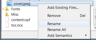
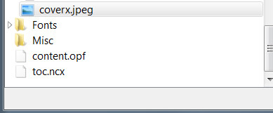
Then, simply right-click anywhere in your Images folder, or on the Images folder itself, and select Add Existing Files. Browse to the new file to be added – the new cover.jpeg I created in this case – and give Sigil a few seconds to import it and add it to the manifest.
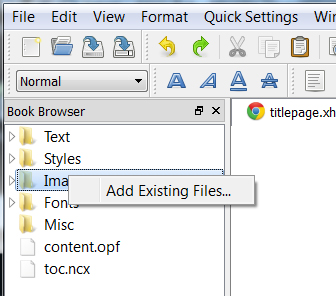
In the meantime, the code on whatever page you’ve created or generated to hold your cover image will have changed to reflect the renamed cover image from a step before. In my case cover file is titlepage.xhtml, and the code within the <body> tags looks like this:
<body>
<div>
<svg xmlns="http://www.w3.org/2000/svg" height="100%" preserveAspectRatio="none" version="1.1" viewBox="0 0 1536 2048" width="100%" xmlns:xlink="http://www.w3.org/1999/xlink">
<image height="2048" width="1536" xlink:href="../Images/coverx.jpeg"></image>
</svg>
</div>
</body>
See coverx.jpeg in the code above? Next, I deleted coverx.jpeg from the Images folder.
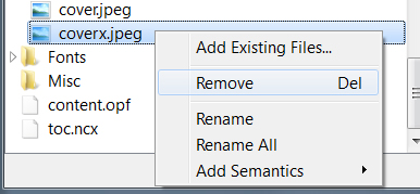
Finally, I renamed coverx.jpeg to cover.jpeg in the code above, adjusted the viewBox values in the SVG code, and the height and width values in the image code. The code then looked like this:
<body>
<div>
<svg xmlns="http://www.w3.org/2000/svg" height="100%" preserveAspectRatio="none" version="1.1" viewBox="0 0 1213 1618" width="100%" xmlns:xlink="http://www.w3.org/1999/xlink">
<image height="1618" width="1213" xlink:href="../Images/cover.jpeg"></image>
</svg>
</div>
</body>
At this point I saved my file. I usually save multiple versions of my ebook files with the book title, the target device and the version number in the filename so that if something goes wrong with a new version I can go back to an old one. Yes, sorry, I know that sounds a bit patronizing to people who do this stuff every day, and almost nobody else cares, but it needs to be said for those who are learning along with me here.
After a quick preview I added the new asset to my book package and re-delivered to Apple. Again, I got iTunes Producer’s ITMS-9000 Apple Behaviour Modification Error warning me that I will soon be forced to comply with new cover dimensions for the marketing image, but otherwise, all was well.

The 1400 x 1400 min does not mean they will want square covers. This is Minimum. If your rectangular cover is 1400 x 2400 it meets the minimum. 🙂
Hi R.V. – yes I understand this, I was just making the point that there will be pressure on publishers to make square covers. I’ve been seeing square covers for ebooks in various online retailers, so it is happening somewhat.
Hi Allen,
Thx for this informative and well-written piece.
I’ve decided to start an eBook, basically a kind of eText, a textbook for an online course I have made about the Phi Ratio/Golden Rectangle geometry.
I’m trying to make sense of the various options regarding formatting and distribution. At this point my main question is, I expect to have a large number images, and I wonder what are maximums or ranges of individual images (canvas size and image size) and also the total file/whole book.
I see from your above there are considerations relating to what device they’ll end up on too. There’s a lot of info to consider… I’d like to just start writing but I want to avoid the kind of simple, glaring error you can make by jumping into something without proper research. Can you give me any points?
Thanks
Hi Michael – my advice would be to go ahead and write! Don’t let technological constraints get in the way of your creative process. Once you have the text and images ready, the job of formatting is very much a separate task.
I would also recommend getting a good editor. This is even more important than the ebook production process, which can be achieved through various methods depending on your budget.
Sorry for the noob question here, but what I don’t get is that I heard the image size has to be 1400 on the smallest side so, with a rectangular book eg like the one mentioned by the RV Windfield above (1400 x 2400) you are going to exceed the 2million pixel max size. Am I missing something obvious here? Is it 2million pixels or something else?
Any info gratefully received! Thanks
Hi Patrick – as it turns out, the max pixel size does not apply to the cover you upload separately in iTunes Producer – that can be as large as you want, and it should be at least 1400 pixels on the shortest side.
Also, Apple has increased the size limit for images within your ebook from 2 million pixels to 3.2 million pixels.
Thanks! I had this same problem and you helped me solve in 10 minutes instead of hours of fooling with the separate cover image when the actual problem was the interior cover image.